The Taxing Road to Responsive Images
When I wrote my first blog article for this website, I needed an image to spice things up a bit. So I did what any naive frontend developer would do, I added a <img> tag, put my image in the Astro public folder and published the changes. I had tested the website in local development, and after it was deployed it looked pretty good on my desktop PC using a 250 MBit/s internet connection.
<img src="/images/img.jpg" alt="naive approach" />Optimizing the Base Image
Not too much time later I realized that I had uploaded an image larger than 1mb and about 2000px in width. My site had a layout that fixed the content to 640px at that time. The easy way out of that hole was to start properly optimizing images before the upload. Using Imagemagick’s Convert tool makes that pretty easy. I figured a 90% quality setting should be fine. Luckily my image (downloaded from my Flickr gallery) was already at 90%, so I just needed to change the size.
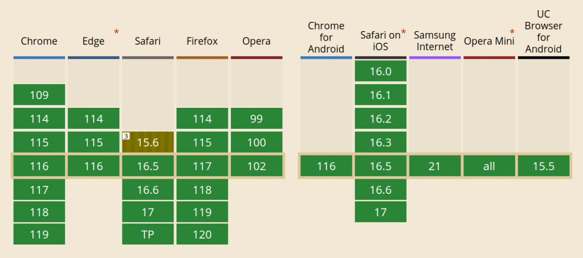
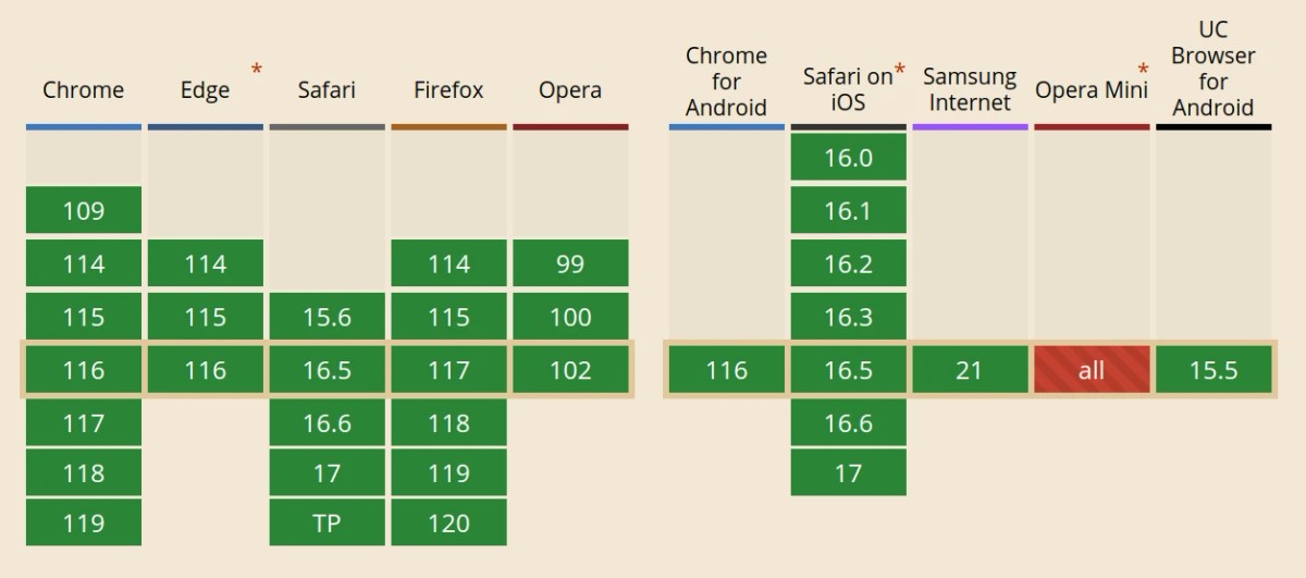
convert myimage.jpg -resize 800x myimage2.jpgDown to 120kb, so around 10 times smaller than before. But what about the file format? JPEG is quite old and there are quite a few modern formats that are designed to replace it. WebP for example.According to Google it’s a good choice and on average about 25-34% smaller than JPEG - at least for lossy images. It’s widely supported, so why not use that instead?
convert myimage2.jpg myimage.webpDown to 90kb, nice! Now I just had to make sure I can really use that instead of JPEG. Browser support looks promising since I don’t really care about IE support. Now there was yet another problem. If I wanted to make use of OpenGraph or Twitter extensions, I had to use JPEG, PNG or GIF. So what now?

<picture> to the Rescue!
“The <picture> HTML element contains zero or more <source> elements and one <img> element to offer alternative versions of an image for different display/device scenarios.” MDN
That sounds incredibly useful, and it’s supported in all major browsers, what a nice surprise!

Using it seems pretty straightforward. I can specify multiple <source> elements, each one containing a type attribute declaring the MIME-type. When used inside a <picture>, you have to use srcset and you can alternatively use a media attribute, but more on that later.
<picture>
  <source srcset="img.webp" type="image/webp" />
  <img src="img.jpg" alt="we're getting there" />
</picture>
Cool! So all of this sounded quite complicated, but now I have a 90kb image that will be used by all modern browsers and a fallback to JPEG if it’s needed. The funny thing is that this is not even close to the ideal solution not the most complicated part, but I promise we’ll get there in a bit.
Today screens have evolved a lot and are no longer the typical LCD screens with 100ish dpi that you still see a lot in laptops or even desktop computers. Most phones and tablets and more and more desktop screens have a higher resolution and a higher pixel density. To make up for that, browsers zoom the pages to reduce multiple hardware pixels into a single CSS-pixel. That’s why you see the following part a lot in mobile-optimized pages.
<meta name="viewport" content="width=device-width,initial-scale=1" />This works well for text and layout in general, but not so much for bitmap images. Depending on the device pixel ratio, some devices can display images up to twice as large in the same space.
Providing Multiple Sources Using srcset and sizes
The srcset attribute lets you specify a list of image sources and one additional piece of information that is either the pixel density that the file should be used for or the actual width of the image in pixels. For very basic use-cases the pixel density is ok, but for responsive layouts that’s not going to work very well. Luckily it can be used together with the sizes property to give the browser all it needs to determine what source to use.
The sizes attribute tells the browser in what size the image is displayed on the page, using media conditions. The browser can then use that information together with the srcset list to fill that gap with the best matching image from the sources. Now you don’t even have to take care of the pixel density anymore, because the media queries already take that into account (…at least that’s how I assume it works).
Here is an example using both attributes that would already work pretty good for full-screen images.
<picture>
  <source
    srcset="myimg-640.webp 640w, myimg-1024.webp 1024w, myimg-1200.webp 1200w"
    sizes="100vw"
    type="image/webp"
  />
  <img src="myimg.jpg" alt="looking good so far" />
</picture>
But of course it can’t be that easy for my use-case. My blog has no full-screen image, but it uses like 95% of the width up to a specific width where it stops growing and stays fixed.
I even added some additional breakpoints for images just to make it harder. Well, actually I wanted to replicate how Medium can display images that grow larger than the text column. I like that look. It improves images on larger screens, because now you see more of the content instead of having a lot of whitespace left and right.
Choosing sizes
My current solution for sizes looks something like this:
<picture>
  <source
    srcset="
      .../myimg.webp?width=2400&f=webp 2400w,
      .../myimg.webp?width=1600&f=webp 1600w,
      .../myimg.webp?width=1200&f=webp 1200w,
      .../myimg.webp?width=960&f=webp   960w,
      .../myimg.webp?width=640&f=webp   640w
    "
    sizes="
    (min-width: 1300rem) 1200px,
    (min-width: 860px) 800px,
    (min-width: 768px) 640px,
    (min-width: 648px) 576px,
    calc(100vw - 72px)"
    type="image/webp"
  />
  <img src="fallback.jpg" loading="lazy" alt="its over 9000" />
</picture>
In the first moment this looks quite complicated, but I promise you it will all make sense soon. Remember when I told you about the fixed max-width of my page content before? I said it was 640px and that number sits right there in the sizes list. The media condition is specific to my layout. Between the left and right viewport borders there is some padding, so what I’m telling the browser here is that between 648px and 768px viewport size it should use the next best image that fits into 640px from the srcset. This would be the image with 960px width, or it could even be the one with 1600px width, depending on the device pixel ratio. I hope now you can understand how sizes is used and how it closes the gap between image sizes and page layout.
Am I Overdoing It?
Having a fully responsible image setup is cool, but it also comes with a downside. For every image I want to use in an article I now have about ten images that need to be created and uploaded. Luckily Astro provides a great feature for automating image conversion and formatting. After building an own component for that I am able to import a single base image in my blog post and Astro converts that into the full list of sources with srcset and sizes props. I will soon post an article about how to do that, so stay tuned!
Converting those images still takes time and CPU resources and my blog is currently not very large. I’m sure the build time will get notably longer once I have more than a hand-full of posts with images. But if that ever becomes a problem I might just reduce the number of images created.
The Media attribute
Sometimes it’s necessary to use a different image for certain breakpoints. This would be a problem, because the srcset is just a suggestion for the browser, not a strict directive. Luckily there is the media attribute for <source> elements. It lets us add a media condition that is required for this source to be picked by the browser. This makes it the ideal option for design directives, like using a cropped image for mobile devices and the full-sized version for larger screens.